Features · Operational Reporting
The numbers your operation actually runs on
Work order completion, preventive-vs-reactive, breakdown counts, equipment availability, recurring faults — trended monthly and compared across sites. No vanity metrics.
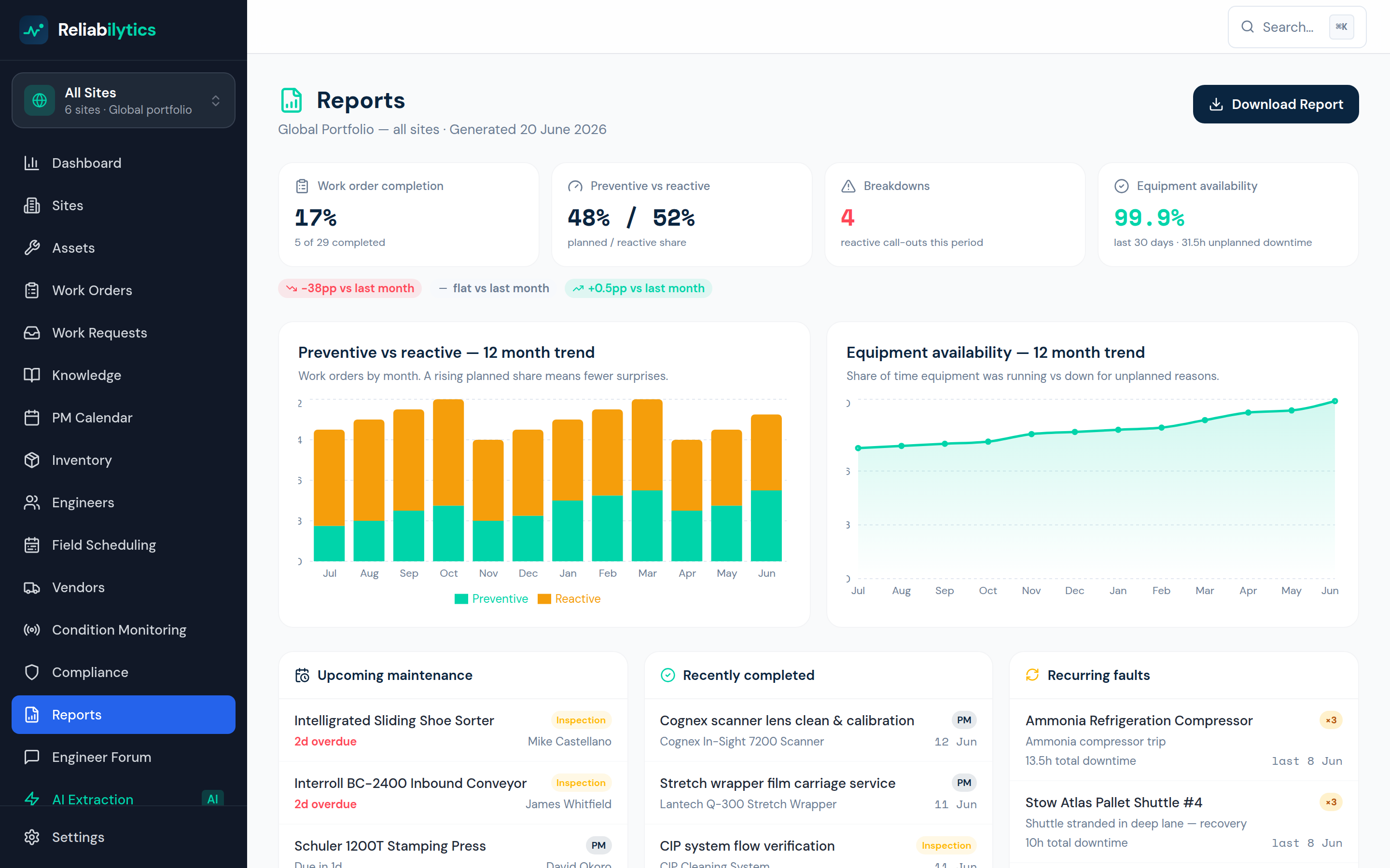
Real product screenshot — this is the screen you get, not a mock-up.
How it works, step by step
Exactly what happens, in the order it happens.
- 1
Headline KPIs, honestly computed
Completion rate, planned/reactive share, breakdown count and 30-day equipment availability — derived from real work orders and real downtime, with month-over-month deltas.
- 2
Downtime logged where it happens
Engineers record asset unavailability on the work order — start, end, planned or unplanned — and availability, MTBF and MTTR are computed from those real windows, per asset and per site.
- 3
OEE with honest inputs
Availability × performance × quality per asset. Availability comes from logged downtime; performance and quality are set per asset until live data exists — no invented numbers.
- 4
Twelve months on two charts
Preventive-vs-reactive stacked by month and an availability trend line — the two graphs every operations review opens with.
- 5
Operational panels for the daily huddle
Upcoming maintenance by equipment, work completed in the last period, and recurring faults (2+ occurrences on the same asset) flagged for root-cause attention.
- 6
Sites compared on the global view
Completion, preventive share, breakdowns, availability, overdue compliance and average health per site — sorted worst-first so attention lands where it's needed.
What it changes for your business
Reviews run on evidence
The monthly meeting starts from the same live numbers everyone can drill into.
Recurring faults get engineered out
Repeat offenders are surfaced automatically instead of hiding in the noise.
Print-ready in one click
The report is the board pack — no copy-paste into slides.
Use operational reporting today
Get started with Standard, or open the live demo — no signup required.